

Play
Creative Designs
Dive into my gallery of exploratory design work. Below are the outcomes of client-facing initiatives from design bootcamp & old projects I’ve redesigned for fun.
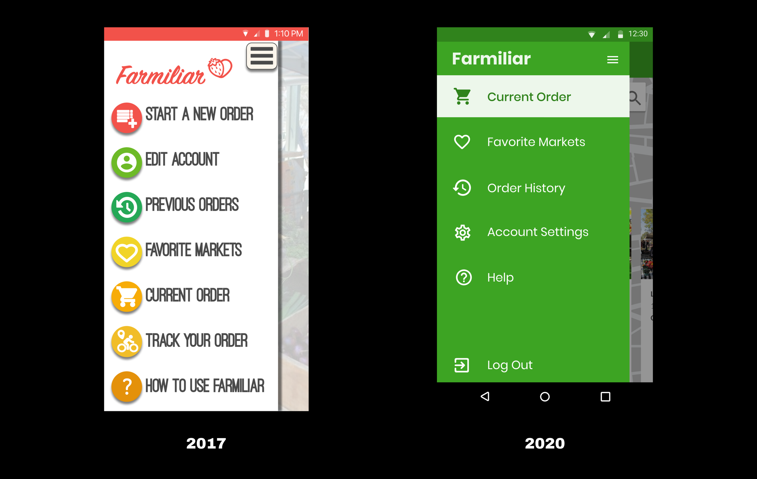
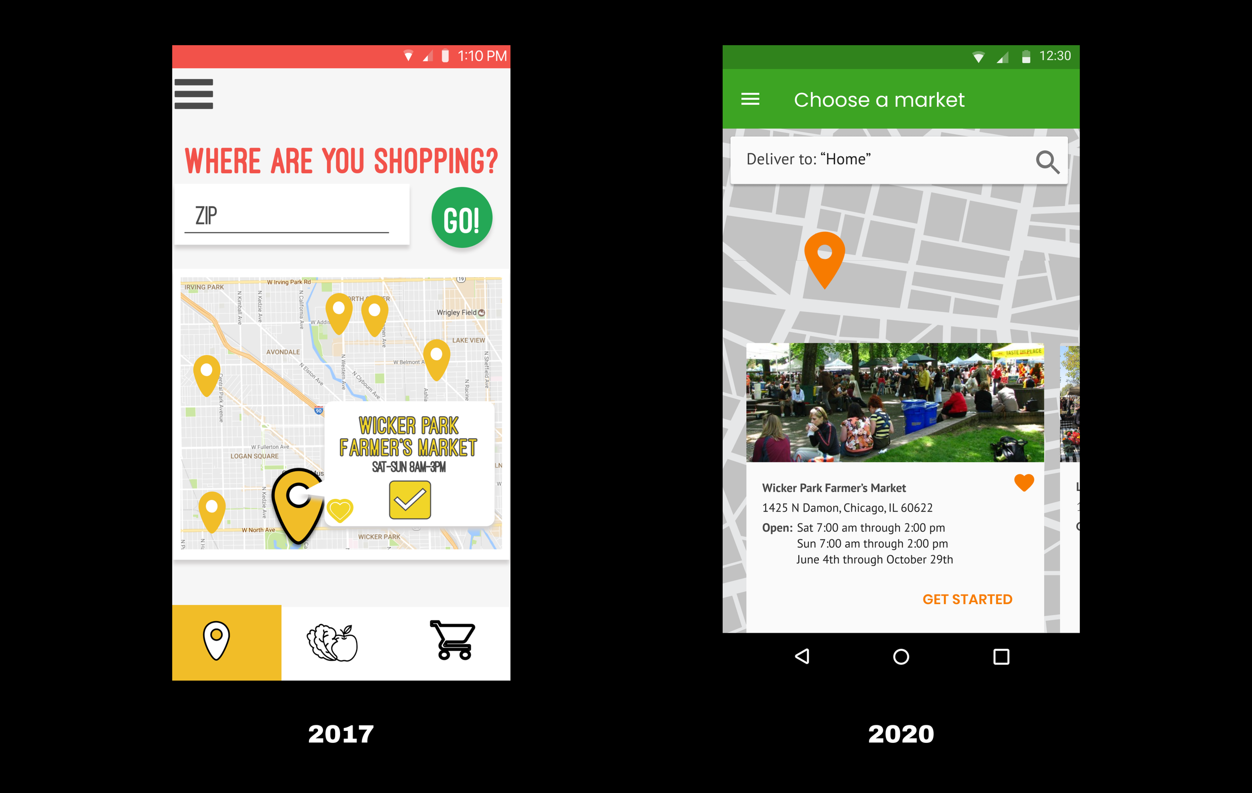
Farmiliar
Designation (boot camp) | Mock Project (2017), Redesign (2020)

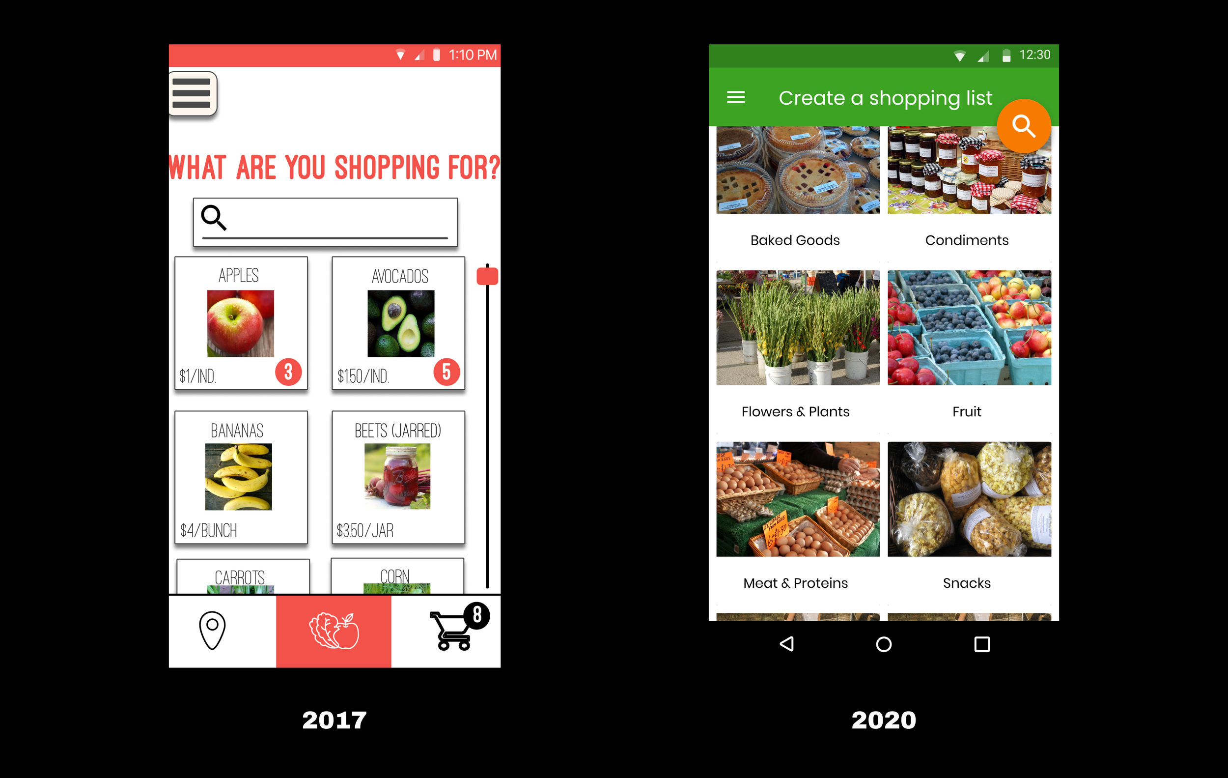
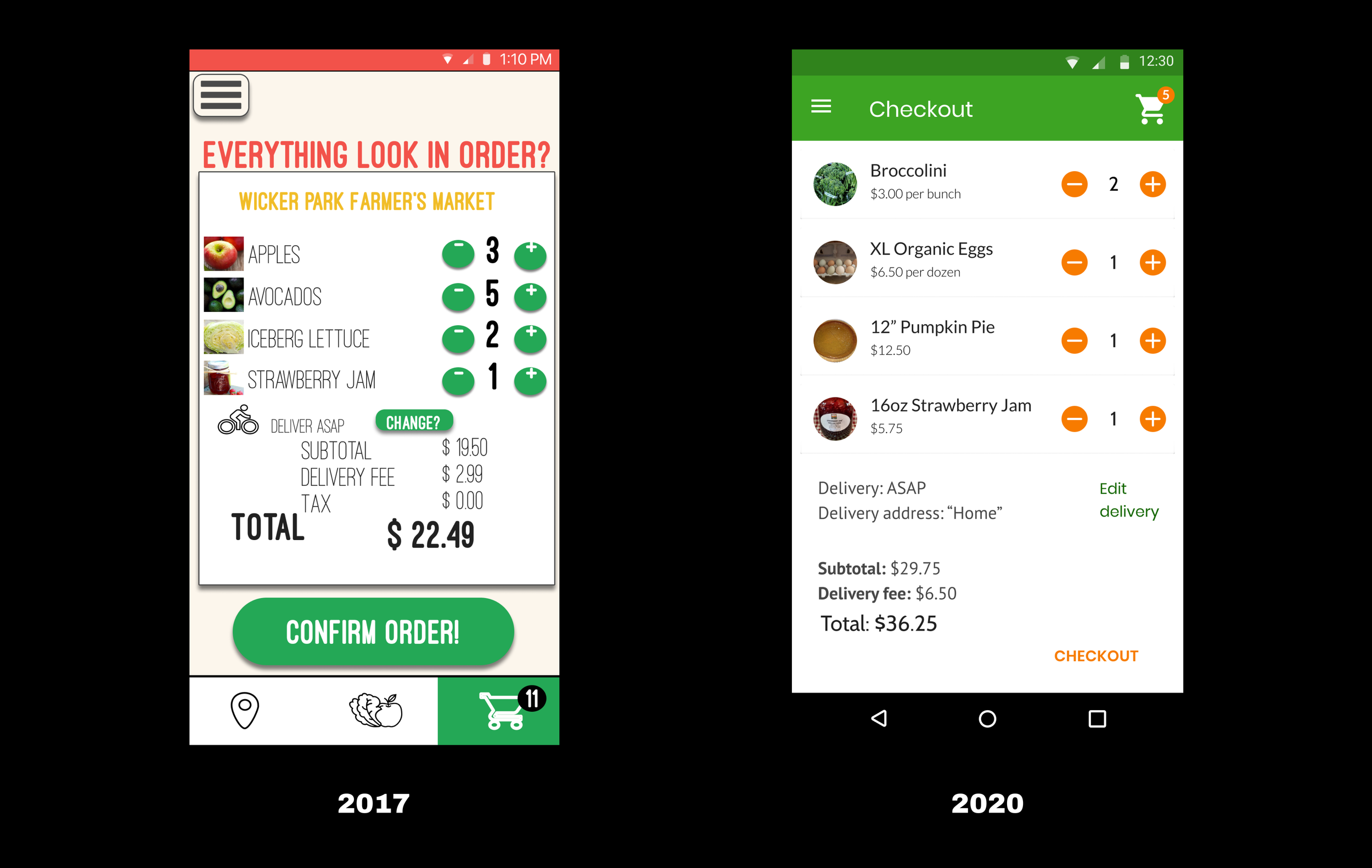
“Farmiliar,” a mobile app to connect users with locally-grown produce, was my first ever attempt at visual design. The UI sure is… something.
During the quarantine boredom of 2020, I revisited this concept. The redesign process involved updating UI trends, refining branding, and leveraging user-friendly interactions. This experience highlighted my growth as a designer, emphasizing the importance of revisiting and embracing change for continuous improvement. We’re never done growing as designers!


Tiltas
Designation (boot camp) | Client Project (2017)

In 2017, I designed Tiltas' mobile interface, an app aiming to help former prisoners reintegrate through mentorship and job opportunities.
Over 3 weeks, I built out the UI and aimed for a distinctive visual identity. User testing in re-entry centers empowered me to refine designs, resulting in hi-fidelity mockups, a clickable prototype, and a style guide, leaving a significant impact on my professional growth.
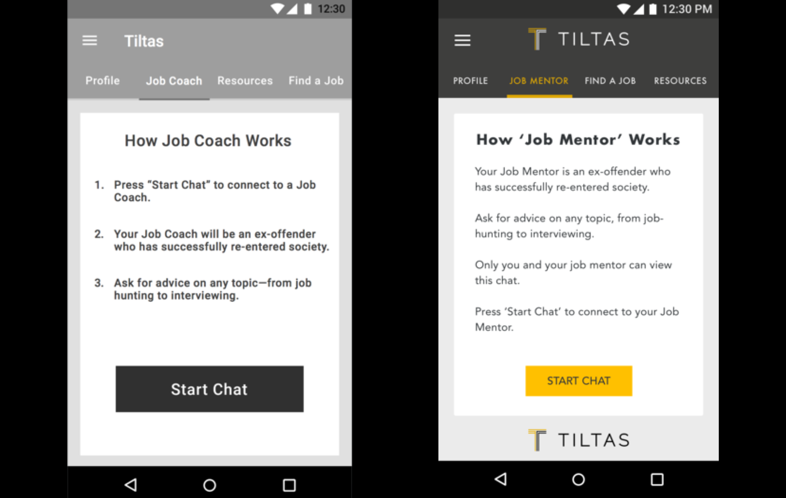
Guided by a UX designer's wireframes, I looked for opportunities to enhance usability and improve written content.

I emphasized bold visual styles, both color and text choices reminiscent of sports brands like Nike.
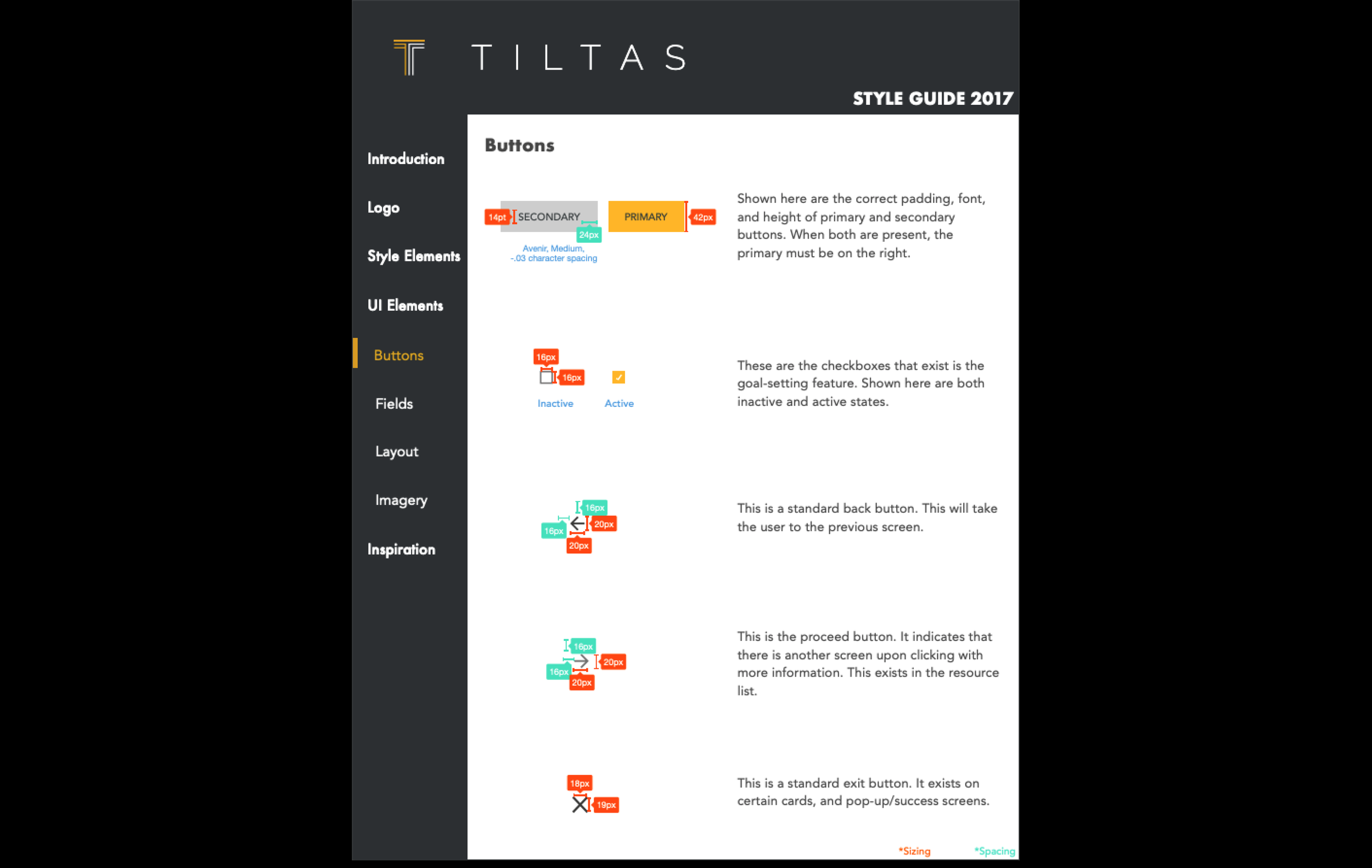
I delivered a comprehensive style guide, complete with all the elements and guidelines that the client may need to launch Tiltas.

These are hi-fidelity mockups of the job search flow through Tiltas.
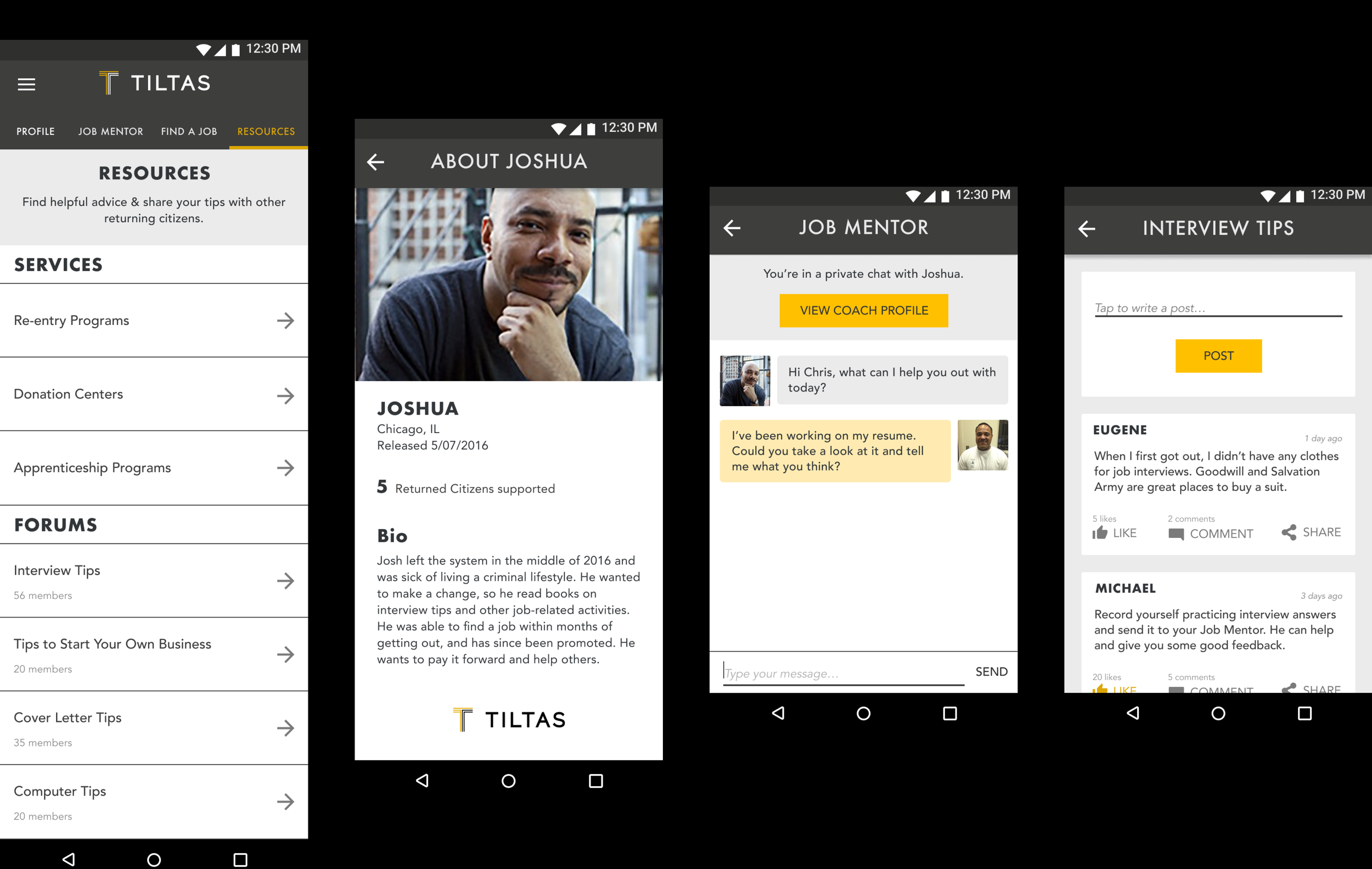
Organized resources and mentorship opportunities were crucial in ensuring user success.

I aimed to drive motivation by goal-setting and celebrating "small wins."
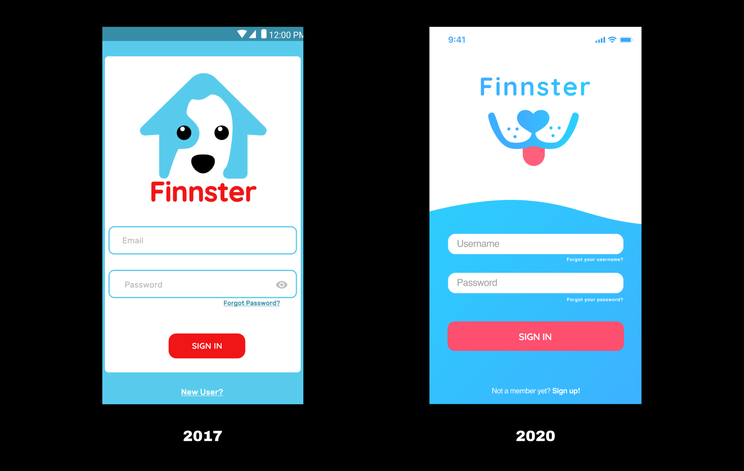
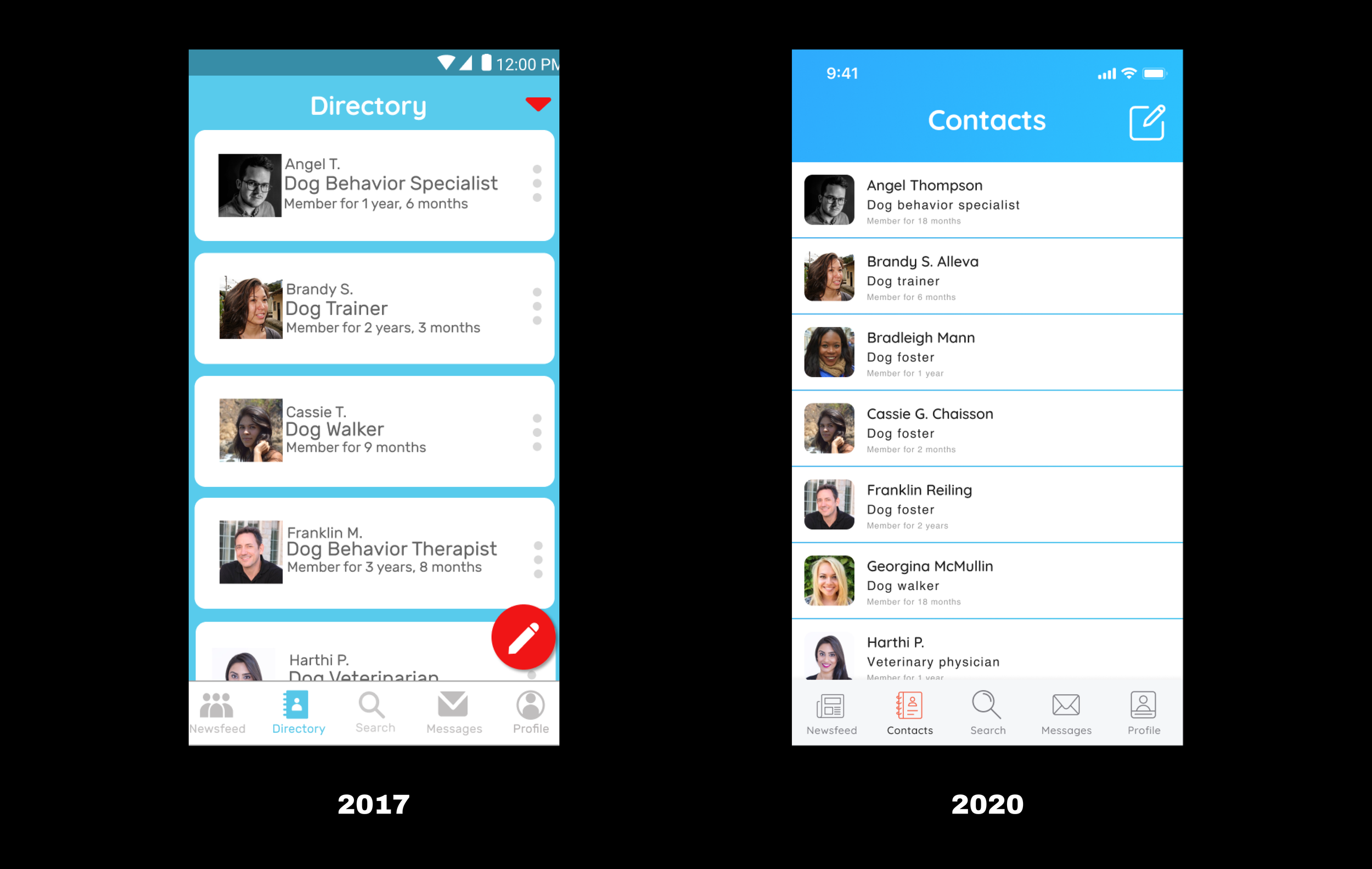
Finnster
Designation (boot camp) | Mock Project (2017), Redesign (2019)
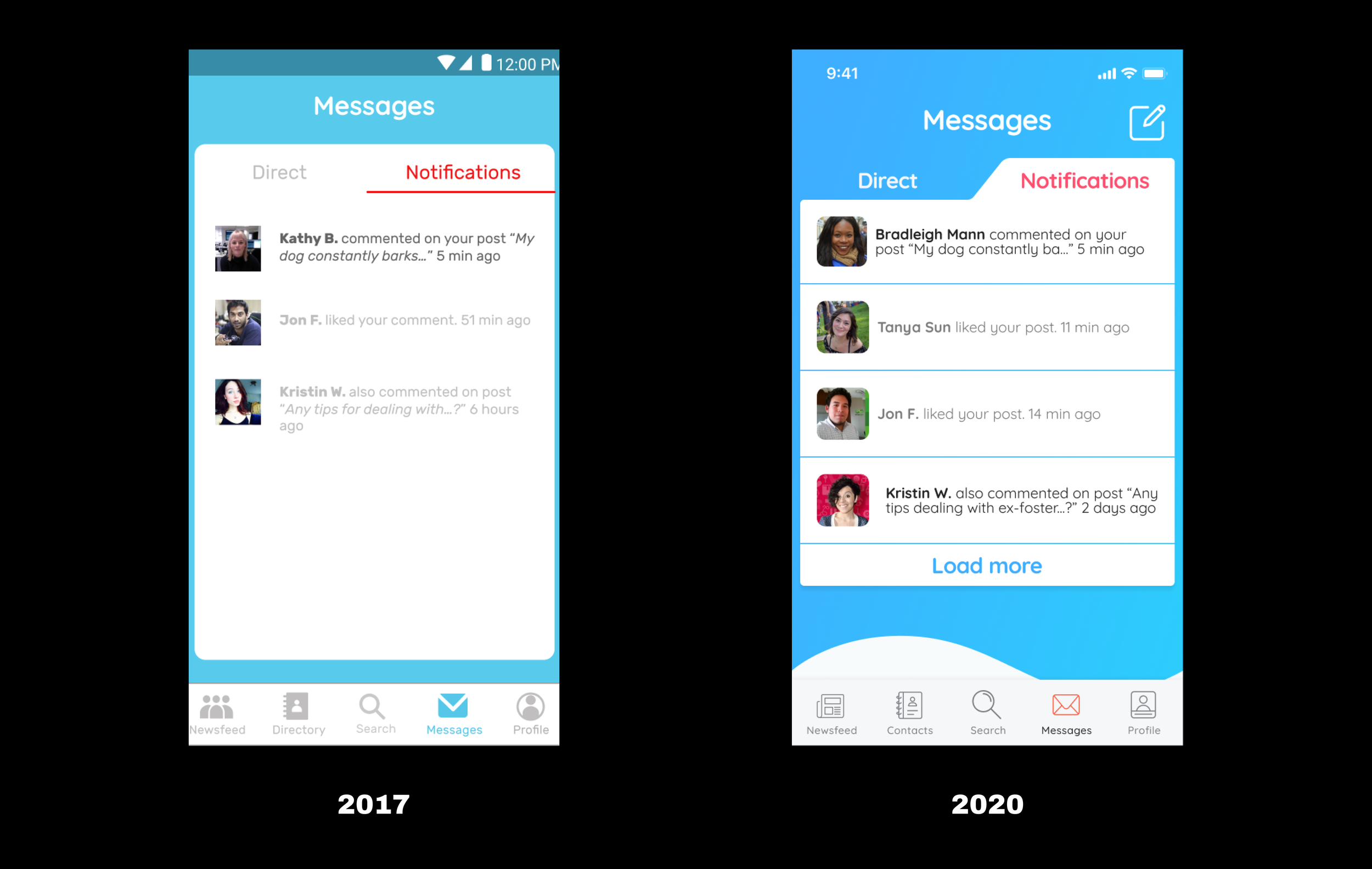
In 2017, I undertook a project to design the Project Adoptable mobile app, providing resources for dog fosters. Inspired by the founder’s story, I named the app Finnster.
In 2019, I revisited the design for fun. I refined its visual identity, focusing on a professional appeal with subtle adjustments to colors and CTAs. I love this project because it addresses real-world challenges with the potential to inspire hope.


Omnipointment
Designation (boot camp) | Client Project (2017), Redesign (2020)
In 2017, I was tasked to design the UI for Omnipointment, along with a suite of similar tools for college-aged users tackling student projects.
In 2020, I revisited these deliverables, refining layouts, color schemes, and app navigation. The goal of this redesign was to flex my visual design skills, build out more modern interactions, and create something college-aged users would prefer to use.
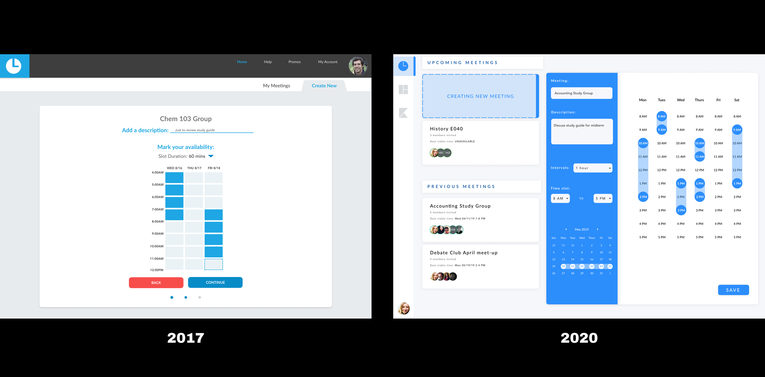
This is what the user sees as they create a new meeting invite, fill in the details, and select their own availability.

This is what the user sees as soon as they’ve successfully created their meeting.
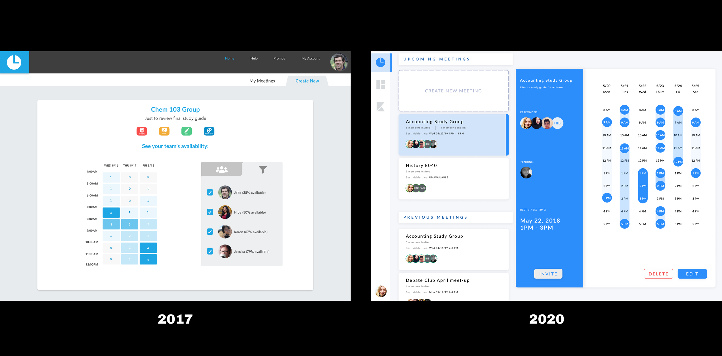
This is how users can view all team members' availability, simplifying scheduling.
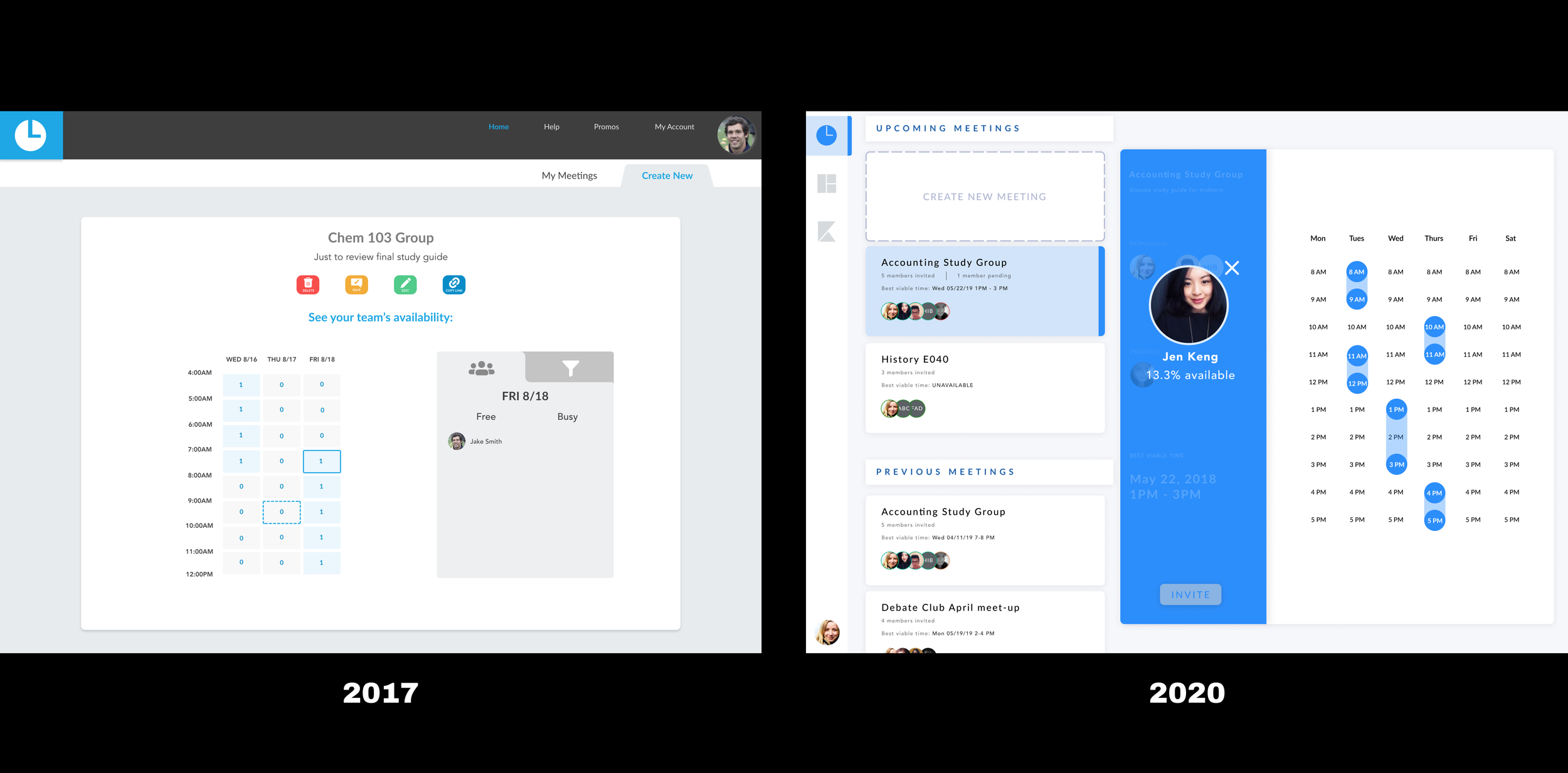
This is how a user highlights a single team member, viewing their individual availability.
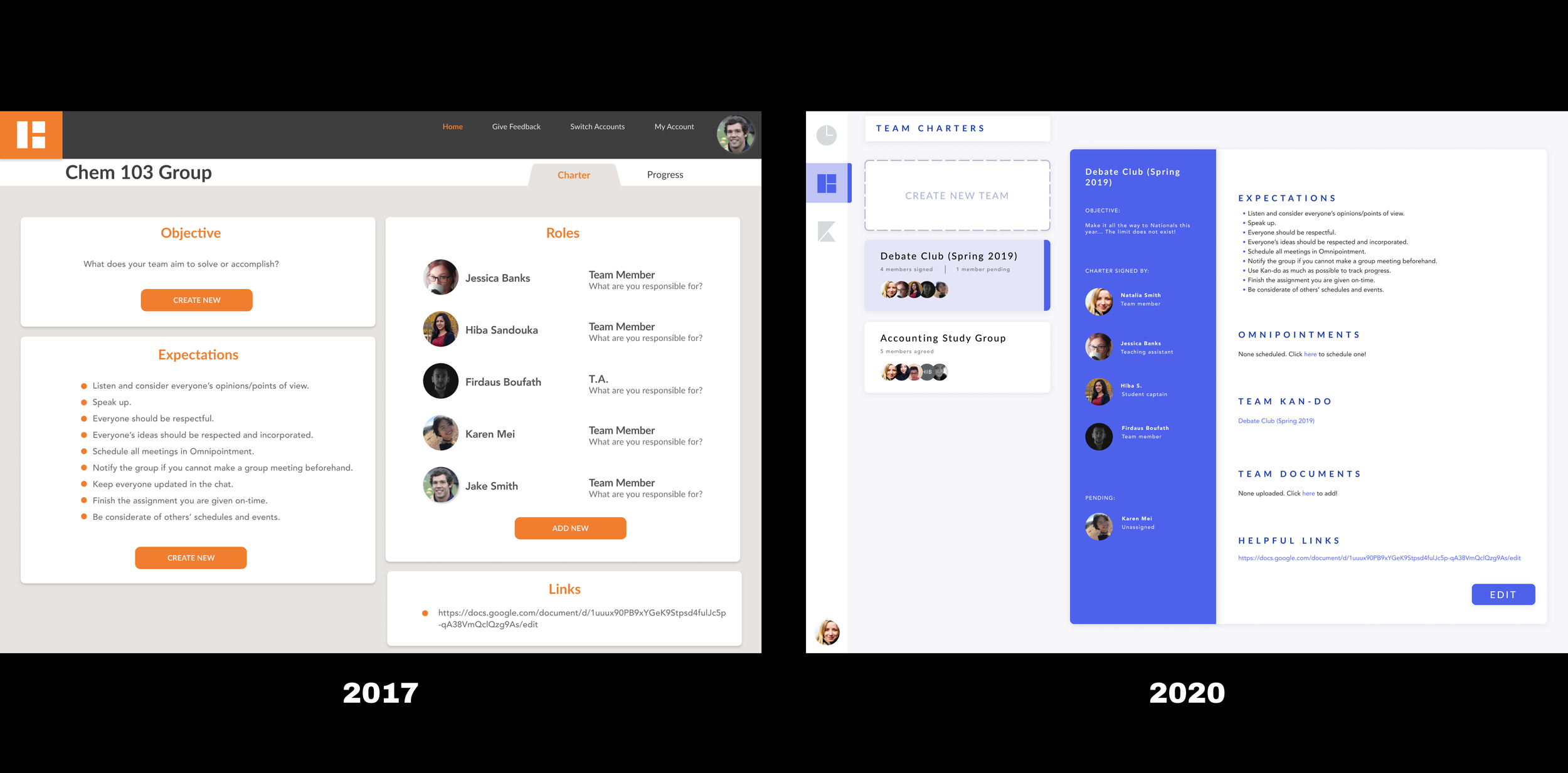
This is a concept for Charter, another product in their suite. I modified the color scheme and adjusted the layout to be more modern and consistent with Omnipointment.
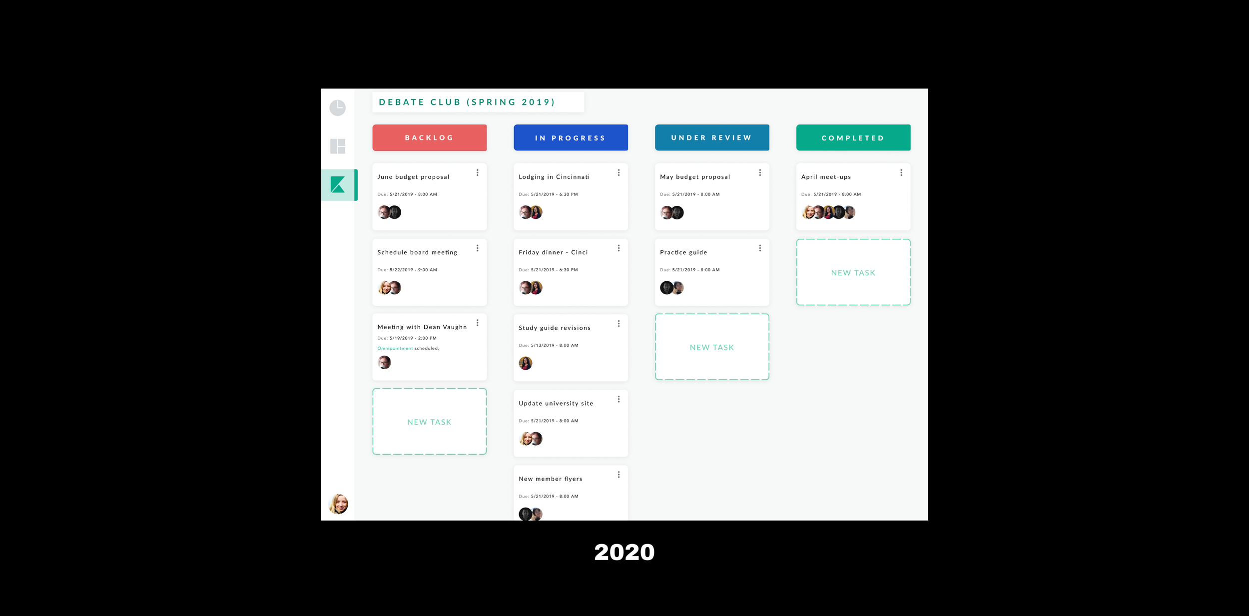
This is an original concept for the suite of products called OmniKan. The idea is that its a task-tracker for team projects.
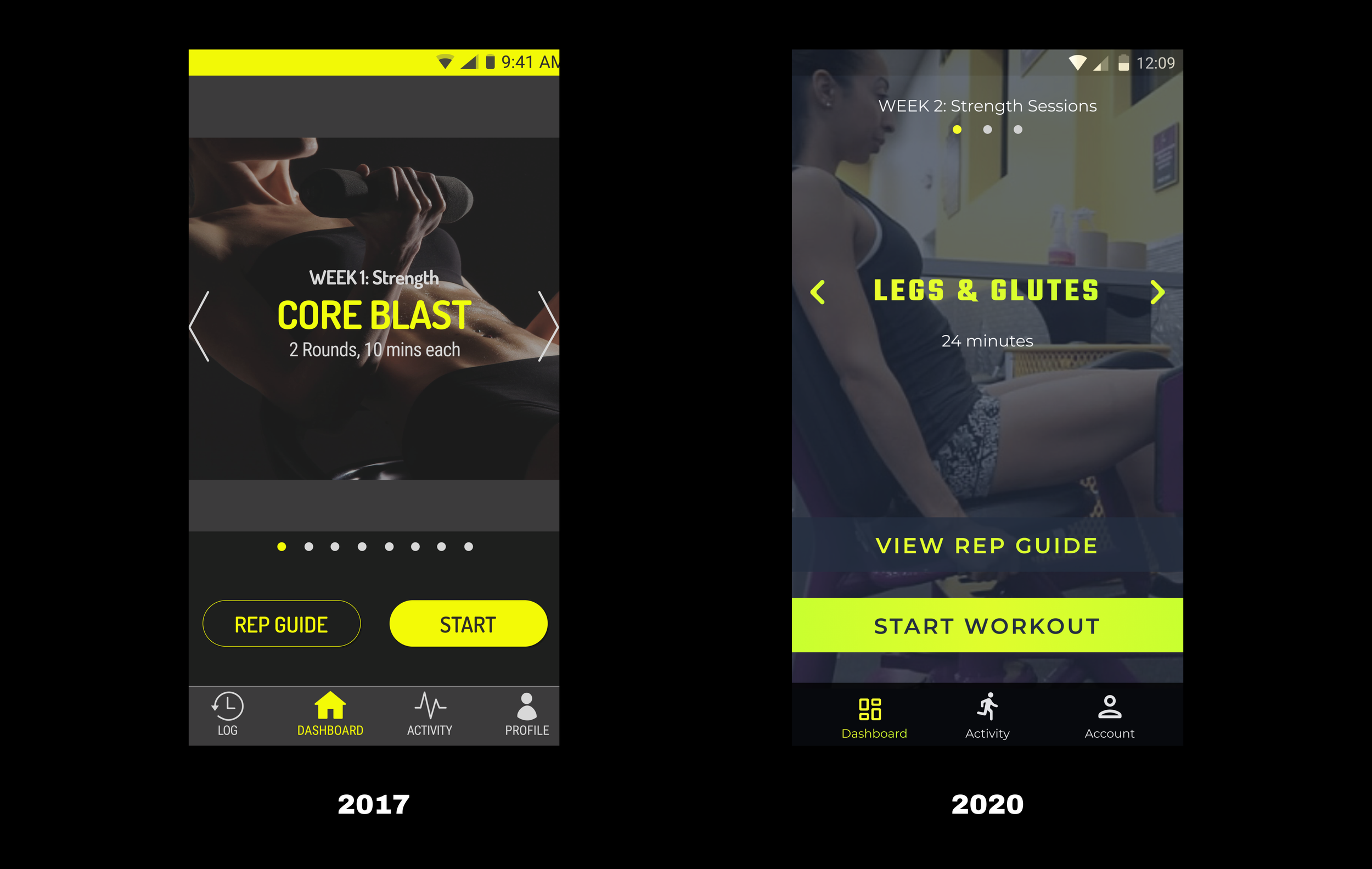
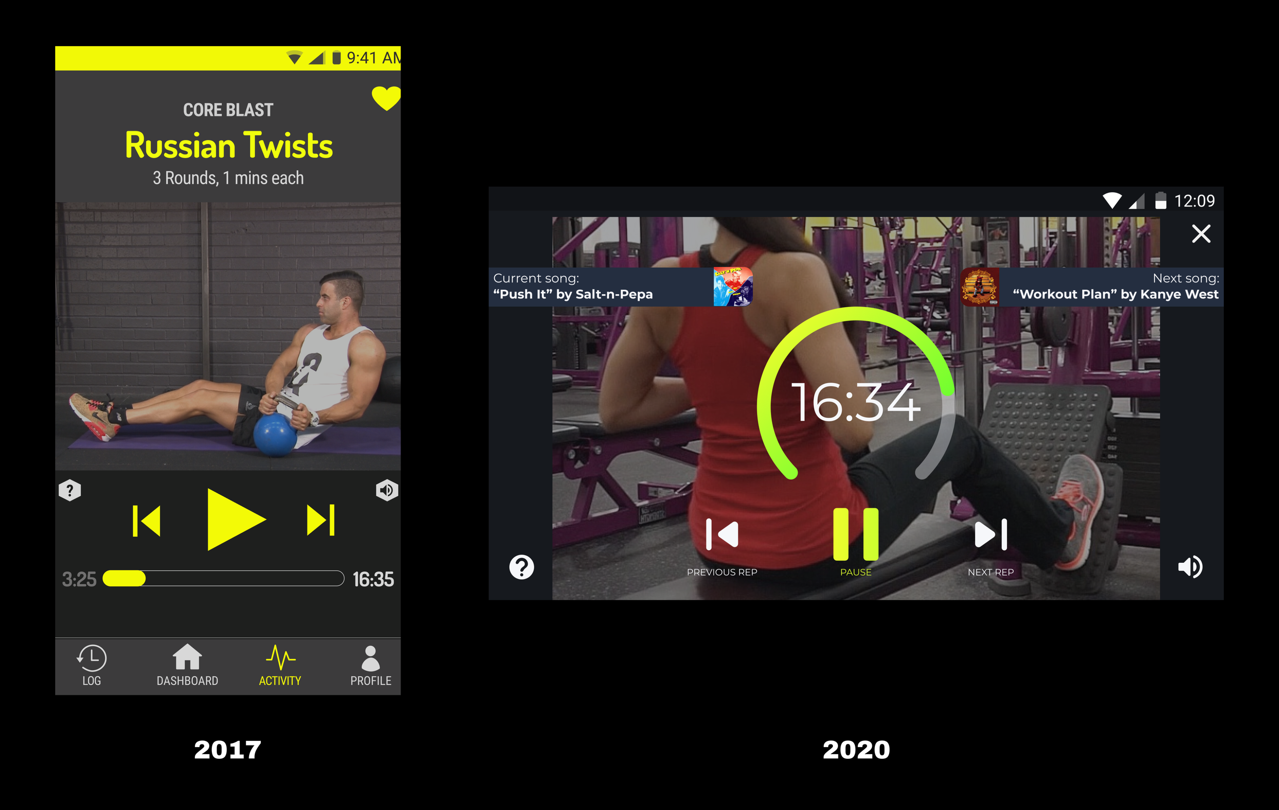
BUZZ
Designation (boot camp) | Mock Project (2017), Redesign (2020)
In 2017, I designed a mobile interface that integrated music with exercise, focusing on users who are new to fitness. I originally called this app “B-Fit” (yikes…).
In 2020, I wanted to redesign to align it with contemporary standards, modern aesthetics, and improved usability. I preserved some bee-themed branding, enhanced dynamic visual styles, and integrated different device orientations. I really love this BUZZ redesign as it allowed me to reframe my design choices and build upon them to improve the experience.